One page website
One page website
Flowers House is a cozy garden café in Hua Hin, built around a pond and surrounded by greenery. It serves breakfast, brunch, coffee and pastries, and the garden is made for slowing down: sit, chat and take your time.
The café had no website of its own, so we started from a blank page with one idea: before guests even arrive, they should feel like they are already sitting in the garden.
This website gives Flowers House a home online. Guests can see the garden, browse the menu and plan their visit in a few taps, while the café tells its story in its own words.
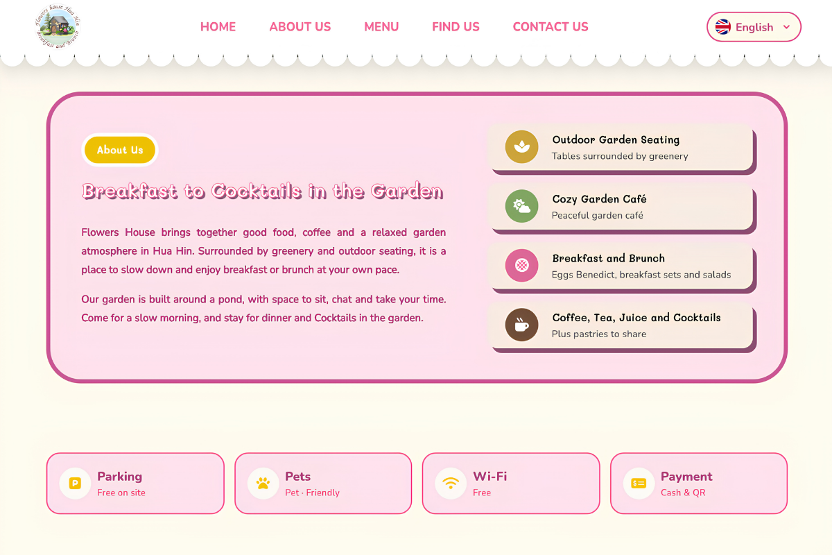
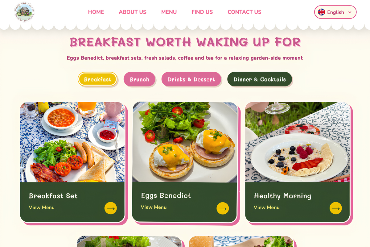
We took our colors from the garden itself: deep green, soft pink and warm cream, paired with the café’s hand-drawn logo of a little house among the trees. The name is set in friendly, rounded lettering, and the rest of the page stays clean and simple so the photos can do the talking.
The home page opens with a full-width photo of the garden, the café’s name and its own line, “Breakfast and Brunch, in a Flower Garden”. Two buttons, “See the Menu” and “Find Us”, lead straight to what visitors need most, and the opening days and hours sit right below, so the basics are clear before anyone scrolls.
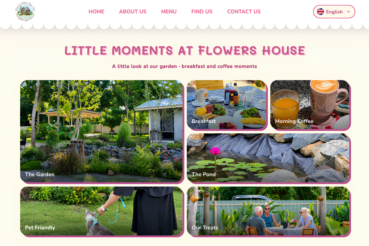
A short story about the garden follows, then a photo section called “Little Moments” that shows the garden, the pond, morning coffee, breakfast, treats and the garden cat, letting the atmosphere speak before any text does.
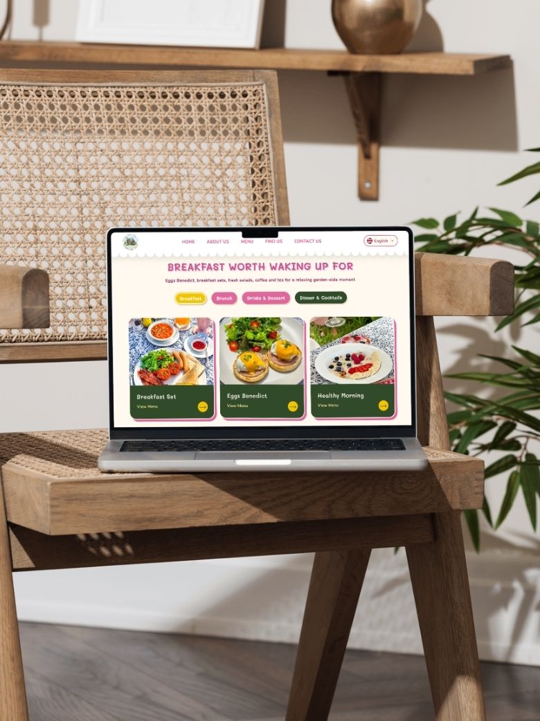
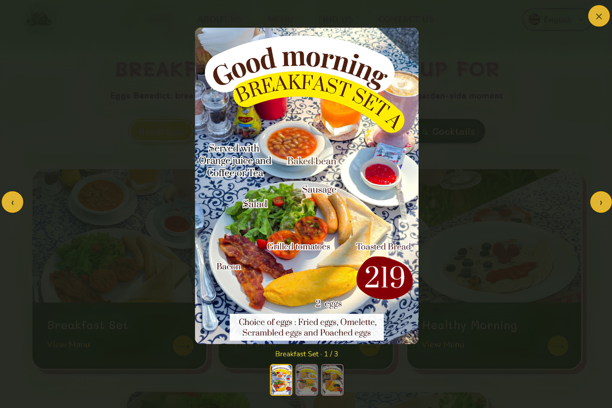
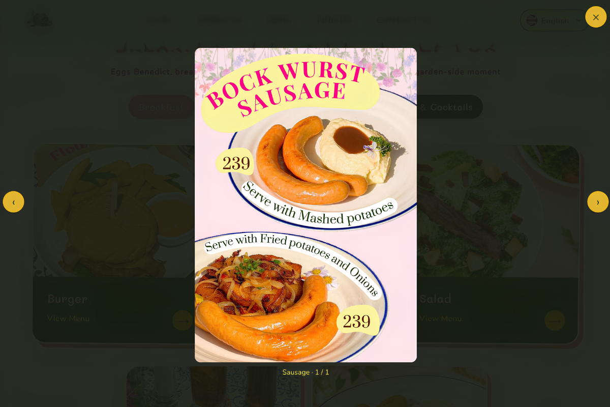
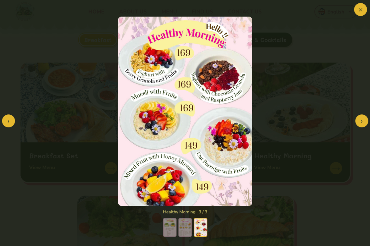
With more than a dozen menu categories, the menu is organized into four tabs: Breakfast, Brunch, Drinks & Dessert, and Dinner & Cocktails. Each category is a photo card, so guests find what they want in a taps.
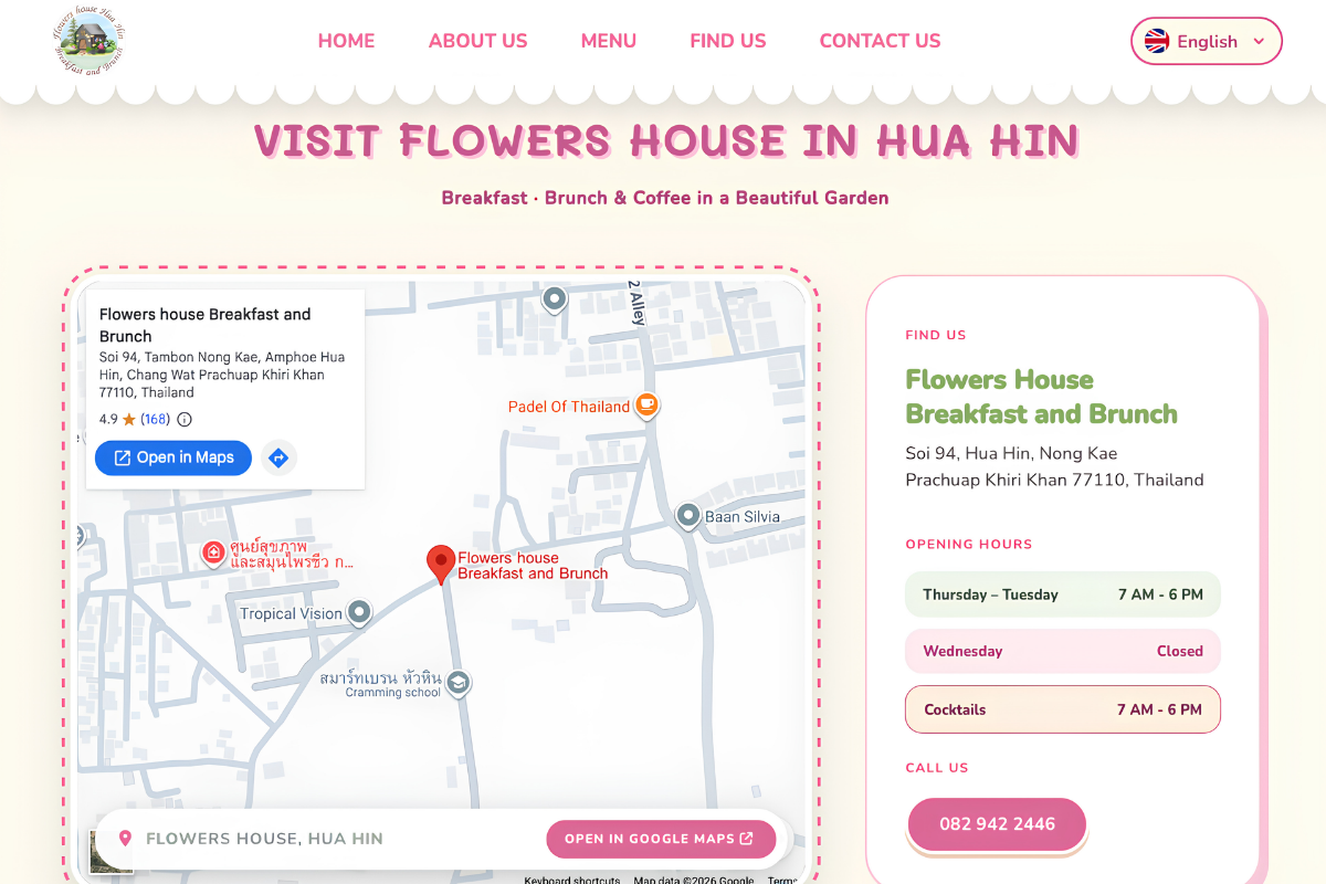
The “Find Us” section brings the practical details together: an embedded map with a button to open Google Maps, the address, opening hours, a phone number that can be tapped to call, and quick badges for parking, pets, Wi-Fi and payment. The footer repeats the essentials and links to the café’s Facebook, Instagram and TikTok.
Modules
Custom features
Flowers House now has a fresh, relaxed website that feels like the café itself: green, calm and unhurried. Guests can browse the menu, see the garden and get directions in a few taps, and the practical details, from hours to parking to payment, are always easy to find. Then they can come for breakfast and stay for the garden.
check_circle
check_circle